GNC ADS
about these designs
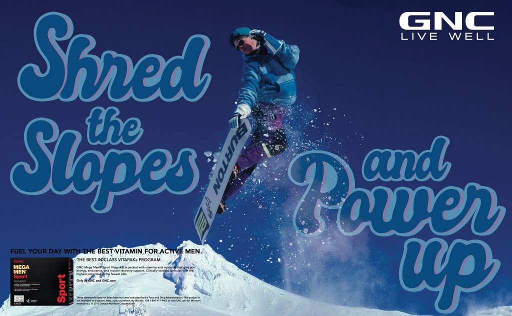
The project for these designs was to recreate an existing GNC ad and use our own type face in it. We also had to create our own tagline for it as part of the project. We could use any image we wanted but it just had to accurately advertise the product, a male vitamin pack. For my first one, “Shred the Slopes and Power Up” I wanted to use a custom script type that really played with the motion of the snowboarder in the middle of the spread. I think this balances the spread really well. The colors are sampled from the snowboarder as well, further integrating the image.
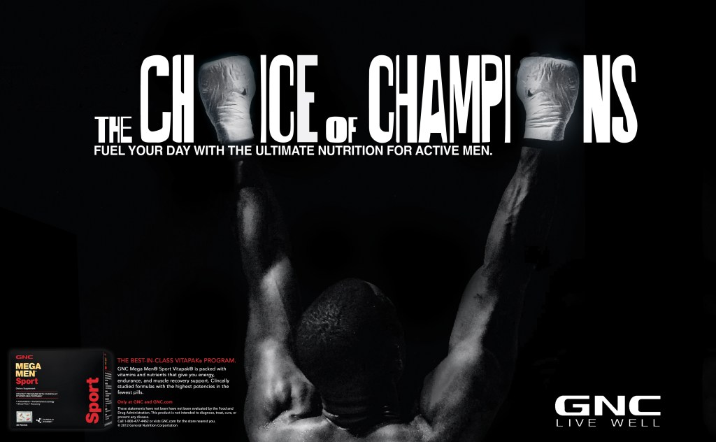
For the second design, I wanted to create something serious, straight to the point, and eye catching. The choice of champions instantly popped in my head as I saw that iconic image of a boxer with his hands up. I really wanted to make the type unique so it’s all custom and plays with the image itself using the fists. It’s all black and white to add to that dramatic effect.
