MILK CARTON PACKAGE DESIGN

about this design.
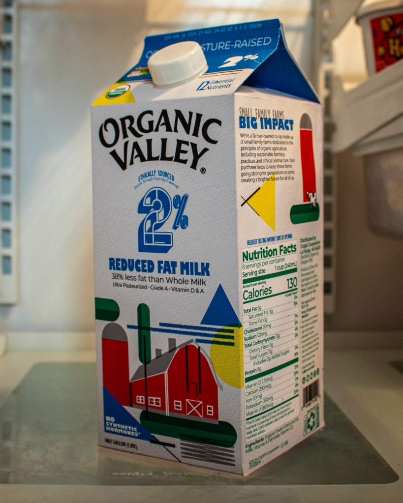
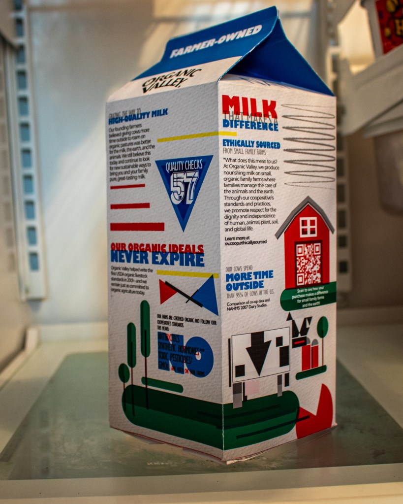
This project was for my 2/D Advertising & Design class, we had to choose an existing milk carton and completely redesign it using inspiration from Bauhaus, de Stijl, and Russian Constructivism art movements. For my milk carton, I looked at the carton that looked interesting, and already had a nice illustration on it, so it was kind of a challenge to come up with something to represent the era of art as well. My design has features of the Bauhaus and Destijl art movements, with the scribbled lines and overlays reminiscent of Joseph Albers. I wanted to have imagery that wasn’t totally flat, so I added a little bit of shading, but it is very 2D in a way, still holding to the principles of Bauhaus art. My cow is something I was having issues within the beginning, I was referencing Picasso’s “The Bull”, which is a way more abstract form than mine turned out to be. I like the result though as it still has the blockiness of the art style. I wanted the cow to be close to the style of Paul Klee, I looked at his color blocking, which in this case, there wasn’t much, but I liked how he illustrated his animals and the movement of them. I used 2 different fonts for this, one has multiple different styles called Gill Sans, I use it condensed and bold for the design. The body copy is in Montserrat, a nice sans serif that flows well with the text curviness of the Bauhaus era. I wanted a focal point to be the 2% on the front of the carton, I felt that was lacking on the original. I made a largescale 2 and designed it to be similar to something you’d see in Bauhaus imagery. This is designed for people of all ages who love organic milk, the colors are inviting and limited, making it simple to understand and navigate. The text is large and bold, so it is easy to read, even in the spots where the overlap each other. If I were to do this again I would focus more on designing a better background for it, I like the shapes but I feel it’s a bit much in places.
