PEARL JAM ADS


about these designs.
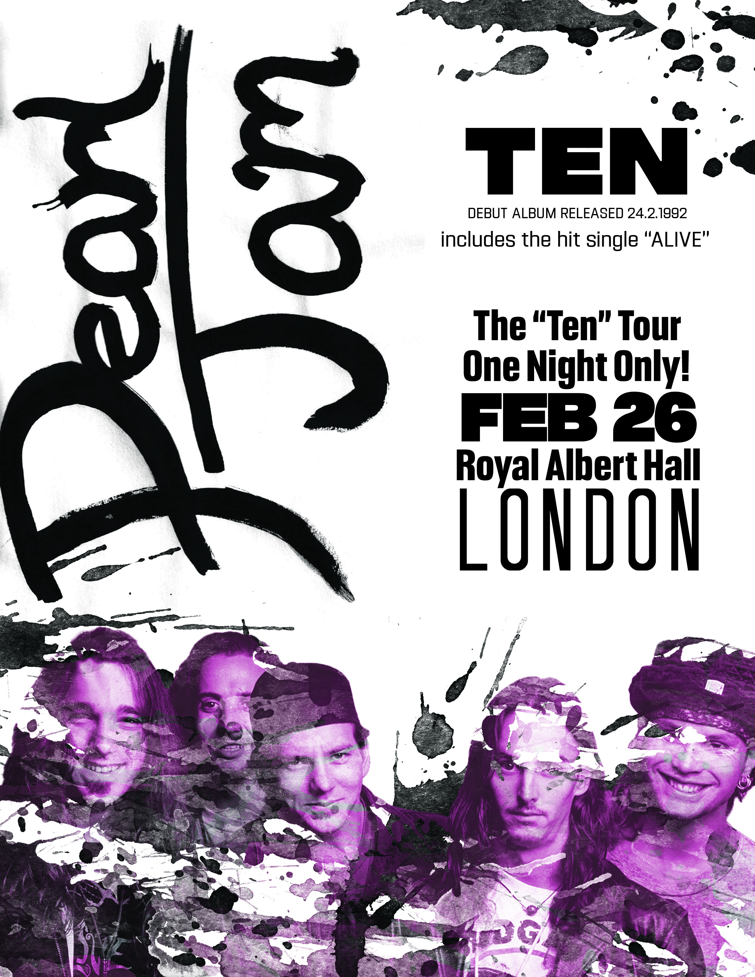
The overarching goal of this project was to use 3 different current design trends and recreate an advertisement using all 3 trends and only one photo. I chose to recreate a Pearl Jam concert poster supporting their first album “Ten”. The first concept is called “Decontextualized”, which in a nutshell is taking things apart and putting them together in a different way, out of context. I wanted to do custom type for all of these pieces so the first one reflects the band name in the middle with this one image displaced at the top and bottom, for balance. The second design is based on the “Inked” trend and it’s pretty self-explanatory. I used a brush and wrote out the world Pearl Jam about 20 times until I got one that I actually liked. I then added in different brushes and paint splatters to really enhance that inked style and feel. I chose the color purple through this one and the last because it correlates with their first album the ad is promoting. The last one “True Grit” is reminiscent of an old western style, so I wanted to use almost a storybook typeface to draw the eye right to the middle. The inspiration comes from old wanted posters and saloon flyers. I added a lot of texture over this one on the stained piece of paper. This was overall one of my favorite projects.
